Over the past few months, we examined the concept and design of eBay icons against industry's best practices. We conducted several studies with eBay users to understand the usage of the eBay icons. We found that many of our icon inconsistencies in design and behaviour cause confusion for eBay users, in particular, those new to eBay.
Based on our research, we've defined some guidelines for eBay icons:
| • |
Icon visual design is consistent. Clickable icons are round and beveled, where as, non-clickable icons are flat. |
| • |
Icon interaction is consistent across the site. |
| • |
Icon alt tag / mouse over text will be descriptive (clearly describe the icon's meaning). |
| • |
Icon should not have text to enable its use globally. |
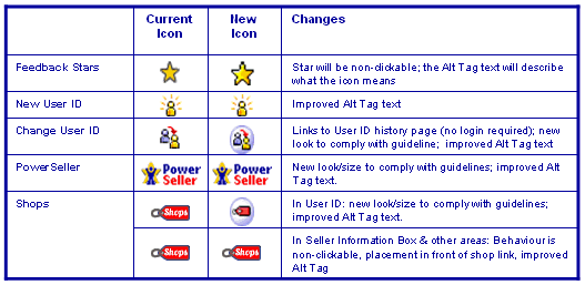
In an effort to improve the understanding about icons and provide you with a more consistent icon experience, we will be changing some of the icon's characteristics to meet the new design guidelines.
In the next few days, we will introduce the new icons that appear next to a User ID. The table below illustrates some of the icon changes we'll implement: